Wednesday, August 24, 2005


Here's the final with colors. logo, pricing, etc. See how huge that SW logo is? It can be challenging to come up with cover compositions that take up only 2/3 of the page but at the same time I'm sure there are people who only pick up the comic because they see the SW logo.

This is the finished version. I drew this on standard Dark Horse art board-- however, I drew it on the front side where all the markings are. These markings usually don't show up when traditionally inked pages are scanned. We now skip the inking process and scan these as grayscale and EVERYTHING shows up now. Some poor guy in the production department at Dark Horse had to go and clean this up and get rid of all the dotted lines so that Brad Anderson could have a clean image to work from.

Wow, after not posting for over a month I'm on a tear!!!

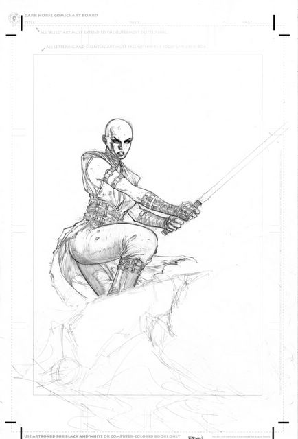
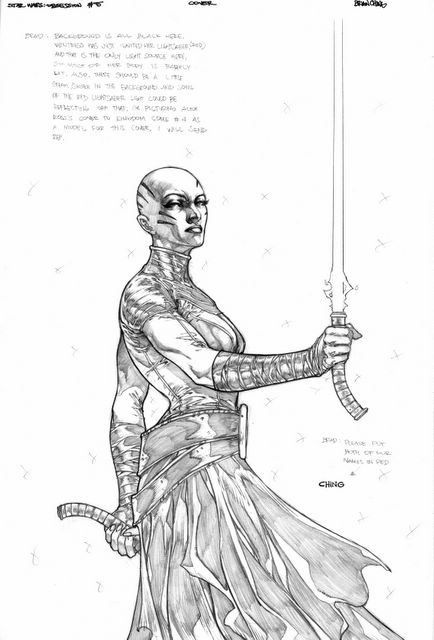
This is an unused piece I did for the SW Republic #60. I was asked to do the cover for that issue and I needed to come up with a look for a younger, non dark-Jedi Ventress. I knew her origin (since my writer, Haden Blackman, was the one who had conceived her backstory) and wanted to come up with a look that was Jedi looking but a little edgier. So I gave her the tradtional look of the tunic and "skirt" but darkened it up a little by adding the black leather straps all over her arms, waist and even a little under her tunic.

I made the HUGE mistake over trying to do it all on the cover without a rough. Come up with a pose, a composition, and a new costume all at the same time. Terrible mistake and this is what I ended up with. It was nice to be able to figure out her look but it was so squashed and forced and after many tries to fix it, I came to my senses and realized I needed to start over.

Here's the finished piece, minus the huge Star Wars logo. Some of you can read my notes and know that the background colors and mood was inspired by Alex Ross Kingdon Come #4 cover with Superman standing amidst all this red smokey destruction.

BTW, some may not know but when you click on the link and look at the pic in FLICKR, you'll see a bunch of options at the top of the image-- just click on the one the magnifying glass and you'll see the drawing almost full screen.

Here's the original finished cover pencils for the cover. I did a little bit to fix up the head-- I went for subtlety here, trying to giver her an expression that conveyed both anger and sadness ( I know, I'm very deep). I'm sure you'll still be able to pick up a ton of flaws but for the most part I was pretty happy with how this thing turned out. You can see some of the notes I wrote down for the colorist, Brad Anderson. He's so good that I really don't need to say too much and he can pretty much get what I want. And as usual and as expected he did-- you'll see on the next post.

Coming up with the cover to SW Obsession #5 (click HERE) was pretty tricky for me. (possibe SPOILER WARNING to anyone who hasn't read Obsession yet) We knew we wanted to have Ventress on it but we wanted it to be done in a way that we weren't revealing whether or not she was actually alive. It had to be ambiguous and somewhat dreamlike. So I came up with this image of her coming out of the darkness and being lit only by her lightsaber and any ambient light bouncing off the smoke. Anyway, here's the initial (very) rough layout I did for it. You can see a ton of problems all over this piece. The expression, the size of the head in relation to the body, the gigantic hand, etc. Yuckkk, it's hard for me to even show this piece.

Here's the finished color version handled by Udon. I never got to speak with them or comment on the colors (that's what happens when you are the lowest artist in a studio with names like Marc Silvestri and Mike Turner) so the colors came out a lot different from what I had hoped. It's a tad bit "happy" (okay a lot happy) for my taste but here it is. But looking back on the cartoon that is probably close to 30 years old, that's how the cartoon looked. Still, it would have been nice to have some input.

Just sorting through some of my old pages recently and came across this page. It was a trading card I did for the Battle of the Planets set that Top Cow put out a few years ago(click HERE for the big version). It might be the first thing I ever did that was intended to be colored directly from the pencils and skip the inking process. I was still messy as hell here and you can see all the smudges that either the production guys or color guys had to clean up. God, they must love me.